Tuesday, June 4, 2013

Peace, Rest, and Relaxation Through Art


I chose “Peace, Rest, and Relaxation Through Art”, as the theme for my final project because I find these to be even more vital since I began college. Being at peace with yourself and with those around you is important because you must like who you are, and fighting with those around you all the time is needless stress. Rest just might be the most imperative out of the three because if you don’t get enough, you’ll be on edge, and you can’t get through the peacefully whether you’re a student or an employee. Relaxation comes into play usually when you don’t have enough time to get a good amount of rest, and when you’re trying to remain at peace with all the chaotic situations going on around you. All three of these seem to piece together perfectly in the puzzle of everyday life. I’ve been trying to implement enough time for all these throughout the week so that I don’t feel like I’m losing my freaking mind.
During the trip, I selected 10 items which I thought were good examples of peace, rest, and relaxation, out of those 10 the following 3 each displays 1 of the 3 parts of the theme.
For peace I chose, “Pair of Seated Figures Playing Liubo” which goes goes with, “Liubo Board and Pieces”. Here you can see 2 people playing a game of Liubo . The expression on the left guy’s face seems calm and peaceful. The guy on the right seems a little tenser, but if you look at it from another mindset it would seems as though it was a cheerful game all around and that they are both smiling.
For rest I chose, “Laurette in a Green Robe, Black Background” by Henri Matisse. Here a somewhat pretty woman is sitting down on a luxuriously comfy looking chair, sleeping, with her head looking down and legs crossed. She looks quite content there.
Finally, for relaxation I chose, “Ariadne” by Giorgio de Chirico. In this artwork, I see a well-developed woman basking in the warmth of the sun.  This brings to mind the thought of just throwing one’s self into bed after a long day’s work and just forgetting about the rest of the world.


 Artist:
 Title: "Pair of Seated Figures Playing Liubo"
 Years Completed: 1st century B.C.–1st century A.D.
 Section of Museum: Asian Art


   Artist: Henri Matisse
   Title: Laurette in a Green Robe, Black Background
   Years Completed: 1916
   Section of Museum: Modern and Contemporary Art


Artist: Giorgio de Chirico
Title: Ariadne
Years Completed: 1913
Section of Museum: Modern and Contemporary Art


Artist: Pablo Picasso
Title: Girl Reading at Table
Years Completed: 1934
Section of Museum: Modern and Contemporary Art


   Artist: Balthus (Balthasar Klossowski)
   Title: Thérèse Dreaming
   Years Completed:  1938
   Section of Museum: Modern and Contemporary Art
:
 Artist:
 Title: Colossal Statue of a Pharoah
 Years Completed: (c.a. 1919 - 1885 b.c.)
 Section of Museum: Egyptian Art

 Artist:
 Title: Mummy of Artemidora
 Years Completed: A.D. 90–100
 Section of Museum: Egyptian Art
 Artist:
 Title: Statue of the Goddess Sakhmet
 Years Completed: ca. 1390–1352 B.C.
 Section of Museum: Egyptian Art
 Artist:
 Title: Yuny and His Wife Renenutet
 Years Completed: ca. 1294–1279 B.C.
 Section of Museum: Egyptian Art
:

 Artist:
 Title: Bodhisattva Avalokiteshvara in "Water Moon" Form (Shuiyue Guanyin)
 Years Completed: 11th century
 Section of Museum: Asian Art


Sunday, June 2, 2013

Tuesday, May 28, 2013

LES Galleries Reaction

     The Lower East Side (LES) galleries were interesting to say the least. In my opinion, some of them had a “WOW” factor to them, while others just didn’t make the cut. In comparison to the galleries in Chelsea, there was certainly a lack of qualities which I think are important if one is to exhibit his or her artwork; presentation, better security, and more attentive employees. One thing which seemed to pop out at me was the fact that almost all the galleries I went into, was located in what appeared to be either a broken down little shop, or a very minuscule and poor imitation of the Home Depot. Being as honest as I can be without criticizing too much, I must say, that my surroundings did make me somewhat reluctant to viewing the next gallery and a bit pessimistic. The art itself seemed less monumental in size than that of those in Chelsea. It would seem that the targeted buyers are primarily those who fit the characteristics of a Caucasian New Yorker, between the ages of 20-35. Some of the galleries I observed had what I consider both good and bad art.
One gallery I liked was the Bosi Contemporary gallery which I’d rate a 7.5 out of 10. It had a selection which consisted of a few intriguing pieces made of LED lights, glass, plexiglass, and wood.
The Stephan Stoyanov gallery was not that bad. It had only a few items, but they were somewhat nice. Though it may not have had the great impression as the Bosi, but it was still worth checking out. There were a few paintings which used mainly green, purple, orange, red, and green in big brush strokes. A couple of them had an uplifting feeling to them, while others were a bit of a downer. All in all, I give it a 7.
Finally, with a rating of 4.0 out of 10 is the Brendan Fowler gallery. It was filled with a few pieces which were mostly located in the back. A lot of it looked like random objects thrown together in hopes of looking like something worth buying. There was a multitude of frames stacked one each other giving it a 3D staircase effect. Had it not taken a superfluous amount of space, it would’ve gotten at least a rating 5.0 out of 10.

Tuesday, May 14, 2013

Public Art Reaction


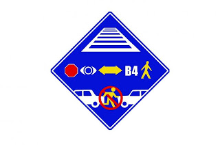
Safety seems to be an increased concern seeing as how the city has gotten students involved in making crossing signs like the one above. Using familiar images, the decoded message screams, “STOP, LOOK BOTH WAYS BEFORE CROSSING”. Will people actually always do so? That’s highly unlikely. Be that as it may, choosing to place it by an intersection just off of Myrtle Ave, I must say is quite an intelligent decision. The traffic there is horrendous. Waiting for the light to change is so infuriating, that many practically just throw themselves into the clutches of danger. Each time someone makes it to the other side, you can almost hear that sigh of relief which in itself says, “Oooh, I’m still alive”, even from across the street. My view on its location is that of a positive one. To have it within about 5 blocks of an intermediate school where students are less guided there than they are while in elementary school, and about 6 blocks from 7-Eleven which is a major hang out spot for those students after dismissal is a brilliant idea. I feel that more signs like this one should be put up, especially near Myrtle Avenue. Implementing crossing safety procedures or reminders like this one is beneficial not only for the children, but for those adults who like to challenge death by deliberately sprinting to the other side against all odds. I pass the area weekly and have yet to see this sign, maybe because I don’t take the time to look at the signs; I just wait for the cars to slow down. Either way, safety is something we shouldn’t take so lightly. Everyday people get hurt because of things they can’t control like war or just struggling to get by, and we have taken our bodies for granted time and time again as though it were nothing. Come to think of it, the fact that the city is now including children in the making of public safety signs, should be a sign to us adults that it’s time for a change, a positive one. So come on people, let’s get it together, me included.
Lead Artist: Chris Soria
Assistant Artist: Cheryl Johnson
Participants: 6th Grade Students of I.S.77
Medium: Printed Metal Sign
Year Completed: 2010
Location: 927 Seneca Avenue Ridgewood, NY 11385
Partners: NYC Department of Transportation

Saturday, April 27, 2013

Chelsea Galleries Reaction

     For this field trip reaction, I have tried cast myself free from the shackles that lock my mind from viewing a very a constricted amount of art as good art, and tried taking the mindset of open- minded art collector. That being said, I shall commence with an artist who I’ve only seen some work of, but very much liked almost instantaneously, that artist is Charles Freger. As I walked in to see what the Yossi Milo Gallery had in store for me to feast my eyes on, I saw an astounding multitude of vibrant colors surrounding me. His collection was called, “Wilder Mann”. There were some I like more than others but out 10, I give it a 9.8. 
     Honestly, I liked this one particularly because it sort of brings to mind (my mind at least), a red power ranger. There were multiple versions of power rangers in which they resembled animals once they morphed. And the red power ranger is my favorite because he is usually the leader. When I look at this photo, I see some level of dominance. It is almost as though it were saying, “I am your leader”.  
     When I first saw this once, I was passing it quite fast, so at the moment I kind of saw a man in a coat who had some sort of Cousin Itt thing going on. I had one of those moments when you think “Wtf”? “Hold up”, and I had to look it over to actually understand what was going on. Once I did understand it, I liked it that much more. To sum up, if I were an art collector, I would be sure to include some, if not all of Charles Freger’s works.


Now as “they” say, “In life one must take the good with the bad”, I do have some less positive things to say when it comes to the works I saw by Richard Hughes at the Anton Kern Gallery. Now as with the preceding gallery, I tried to do a Kelly Clarkson and “Breakaway”, from my first instinct which was to judge before really inspecting, but this time my first feeling was right. I did NOT like it. For one, there were these rather enormous size sticks around that were pieced together. I looked at them and I was like, “Eh” not something worthy of looking at. I thought of the movie, “James and the Giant Peach and asked myself, “Why not try looking at it from another way”? So as I walked around it, I realized they were giant legs. I said, “Conchale (Wow)”. The thought, “Are we being punked”? crossed my mind. I giggled, smirked a little and kept it moving.
Another piece in the group of works by Richard Hughes which I found to be super pointless is was the blocks put together. It looked like a bunch of Home Depot blocks glued together in a rectangle, which was the put to look like one of those pieces you try to pick up before the ball falls in jacks. That and the previous work mentioned in such a big room, seemed like a major waste of valuable space. Looking back, I can’t help but think and say, “I’m glad that we’re able to have art to look at, but to see a big space like that be used for those specific pieces is a waste. Think of all the people looking for a place to live, and a this big chunk of nothing is occupying that space which they could’ve moved in. that is truly sad”. In summary, I would most certainly NOT have this on display. In fact, I WOULDN’T EVEN put it in storage.
     In conclusion, I explored a bunch of different pieces of art, and experienced quite a few different feelings towards them all. I feel not only a bit more open- minded when it comes to art,  but I feel like I've learned of more perspectives in which to look at art from. 

Tuesday, April 16, 2013

Lib 110 Project


     This is an imitation of Wassily Kandinsky’s, “Colorweaver”. It is a good imitation of it because it does exactly the same as if Kandinsky were to do it again. You start off by dividing a sheet of paper into four equal pieces right down the middle. Once you’ve divided it up, color a triangle in each box located in the center. Next you color trapezoids. Each time you color one in, you must rotate the paper and then change to a different color. As you go along, you might want to vary on the shades of colors that you use. Rather than using a rather dark palette, throw in some very light colors such as sky blue and yellow-green. Each part should have about the same amount of different colors. Each part color should take approximately the same amount of space as the others do. To make sure you are mixing it up enough, every once in a while stop and take a look to see which colors you have been using , and see if there are any other colors you should throw in. All in all, the major key to getting this right is variety and making sure you use a lot of it.

Illustrate a Story

http://storycorps.org/listen/dawn-maestas/


Dawn Maestas | StoryCorps


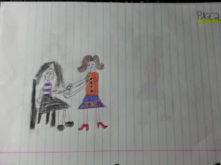
     As I listened to this story, it became more and more interesting. It’s about how one woman went through an abusive relationship and how she helped another woman going through the same situation. Picture one is the beginning of the story which consists of an anonymous woman, who has her boyfriend’s name tattooed all over her. He basically declared her as his property. She is going to Dawn Maestas for help in removing these tattoos and truly forgetting about her ex. In this picture, Dawn sympathizes with her because she went through the same experience.
     In picture two, we see the unknown woman sitting down in a chair. If you zoom in closely enough, you see the name Dave on her are with the about two letters missing representing Dawn Maestas erasing or removing it. So far in picture one in two, the anonymous woman is shown as a big mess. The colors of black and dark purple symbolize how dark she feels inside. Her hair is completely out of whack to show how her boyfriend has made her unbeautiful and not worth taking care of. Also, she is crying in both of these two pictures due to the fact that she is critically sad and emotionally beating herself up.
     In the final picture, the tattoos are removed. Having those tattoos off of her completely, gives her a sense of freedom; she no longer feels like she is someone’s possession. She is portrayed as a completely different person because that is exactly what she feels like. She also feels empowered.

Saturday, April 6, 2013

Design in Our Lives

     In life, be it very simple or very detailed, everything has a design. In this essay, I’ll be discussing four pieces of art found at the Museum of Modern Art, and their ergonomics or level of usefulness/practicality by categorizing them as “high functionality” or “low functionality”. In my opinion, even if something only has one or very few uses, as long as it is able to be utilized numerous amounts of times it qualifies as having high functionality.
     The first piece I’ll be discussing is “Pac-Man” by Toru Iwatani. Although it may be a just a video game to some, to me its way more than that. It proves to be a high functionality seeing as how it became a major attraction. It was put in many arcades and brought in to many homes to be enjoyed by friends, families. It was not only a source of entertainment, but also a kind of a mental workout. On the MOMA website it says “ Iwatani wanted to develop a nonviolent game for the teenage couples and groups that were beginning to frequent arcades in addition to boys”. Right off the bat, Iwatani knew that his creation would without a doubt prove to be quite successful. 

     Secondly, I’ll focus on “Endless Flowing Rocking Chair”, by Dirk Vander Kooij. Here is the first piece I would consider as to be low functionality. The reason for this being that it’s merely a chair. Sure two good qualities about this are that it’s a rocking chair and that it’s made completely by recycled plastics, but for me that just doesn’t cut it. Other than that, I see it as a piece of furniture. 
     Third I’m going to write about, “Wall Relief for the Helsinki Pension Institute” created by Alvar Aalto. Here I see another inadequate inanimate object. It kind of resembles a coat rack. That’s pretty much the only reason I see it being used for. Its lack imagination leaves me to put it under the category of nothing above low functionality.
     As a final point, I shall write on Arthur Young’s, “Bell-47D1 Helicopter”. This I can easily say has high functionality. It can be used as an educational device by letting students in, projecting images on a screen in front of them, adding speakers with realistic helicopter sounds to give them the feeling that they’re in a working helicopter. Just the fact that you can use it as an interactive educational experience, makes it so worthwhile. 
     In conclusion, ergonomics or the level of functionality something has is a subject that is open to interpretation. One may look at something and say it’s completely worthless, another might turn around and find a million and one uses for that very same thing. In a situation like this, no one is right or wrong. 


Artist’s Name: Toru Iwatani
Title: “Pac-Man”
Medium: Video Game
Year Completed: 1980-1981

Artist’s Name: Dirk Vander Kooij
Title: Endless Flow Rocking Chair
Medium: Recycled Plastic
Year Completed: 2011

Artist’s Name: Alvar Aalto
Title: Wall Relief for the Helsinki Pension Institute
Medium: Bent laminated birch plywood and metal
Year Completed: 1953-57

Artist’s Name: Arthur Young
Title: Bell-47D1 Helicopter
Medium: Aluminum, steel, and acrylic plastic
Year Completed: 1945


Friday, April 5, 2013

Life Lessons to Get Me Through My College Years

Just made this and put it on my door. This is definitely art in all aspects because I declare it so, it has a meaning behind it which is basically "do what works for you", and its supposed to bring you at peace with yourself and know that you're perfect no matter what others might think.